Case Study · B2B Seller Panel
Torob Offline Panel
The seller-side product that lets a physical shop become searchable, and trustworthy, inside Iran's largest price comparison engine. The task was never really "build a seller panel". It was verifying a real-world business well enough to vouch for it online.
Marketplace B2B Seller onboarding Field research
Project snapshot
My scope
Torob is Iran's largest price comparison engine, and it was expanding from online listings into local shop discovery. I owned three connected pieces of that move. This case study goes deep on the first, and shows the second at the end.
The problem
A physical shop cannot simply be given a URL. Someone has to vouch for its identity and its stock before a buyer will trust it. Sellers with real in-person demand were getting buried behind spammy, fake and outdated listings, and buyers had no way to tell which was which.
- Not a listing problem. Framed as a chain instead: eligibility, verification, activation, catalog, then repeat value. A break anywhere in that chain loses the shop.
- Order matters. Buyers discover the product first and the verified shop behind it second, not the other way round.
- Trust is the product. For a price comparison engine to vouch for a physical shop, the verification has to be worth something.
Research
Four methods, chosen so the findings would survive contact with people who actually sell for a living.
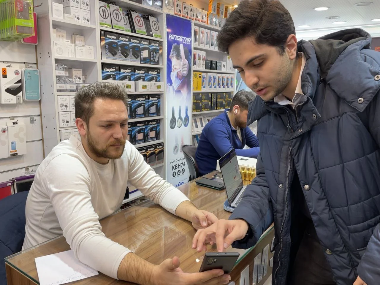
- Blind buyer interviews in Tehran's electronics bazaars, run without leading the answer, so what people said they valued was not an echo of the question.
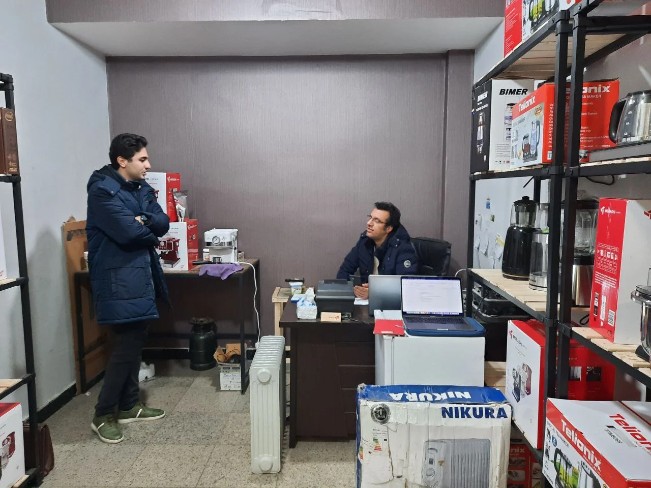
- Interviews and calls with active offline sellers, including sellers who also ran a shop on our main competitor's platform.
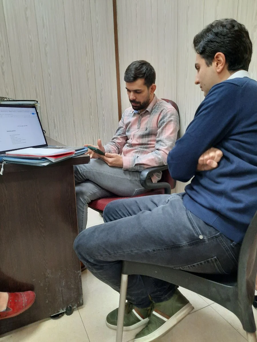
- Structured usability testing on the competitor's seller panel, to document what to avoid before designing anything of our own.
- Working sessions with product, data and growth, to pressure-test assumptions and check we were not reading only from the sellers who had already succeeded.
What we learned
Decision 1: verification before anything else
An eligibility and identity check goes first, confirming real in-person stock before a seller can do anything else. It is the same logic any platform uses before it vouches for who is on it.
- About a third of signups stop here, having said they do not sell in person. That is the gate doing its job, not a broken funnel, and it is why the number is reported separately from drop-off.
- Most small sellers have no formal business license. Testing surfaced that early, so rather than make it a hard requirement we documented the gap and built a lighter identity path around it.
- The trade-off was deliberate: more friction at the start, to protect trust for everyone downstream.
Decision 2: building a catalog without the typing
Re-entering products by hand was sellers' single biggest complaint about every listing tool they had used, ours and the competitor's. So manual entry stopped being the default and became the fallback.
- Search the catalog Torob already has. A seller finds the product that is already in the system and claims it, instead of describing it from scratch.
- Import from where the stock already lives. Many shops already photograph their inventory for Instagram, so that becomes an entry path rather than duplicate work.
- A sales advisor inside the add flow, suggesting trending items, products competitors nearby are listing, and gaps in the shop's own range.
- Manual entry stays, because the catalog will never cover everything, but it carries about 9% of active inventory rather than all of it.




Decision 3: turning usability findings into product changes
Sellers worked through real tasks on the competitor's panel while thinking out loud. Every recurring point of confusion was logged, and the clearest patterns went straight to the product team. Observe, document, hand off, fix, then repeat on the next iteration.
- The active and inactive toggle kept getting missed. It could not rely on a label next to it, it had to read as a state on its own.
- Warranty type mattered more than colour or variant. Sellers reached for it first, so it moved to the front of the form.
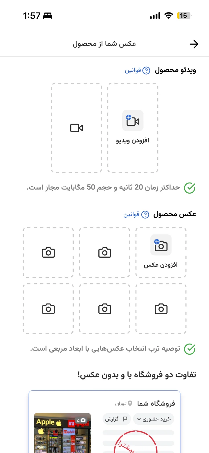
- Photo and video rules were failing silently. Stating them at the point of upload cost less than rejecting a listing afterwards.



The panel a shop comes back to
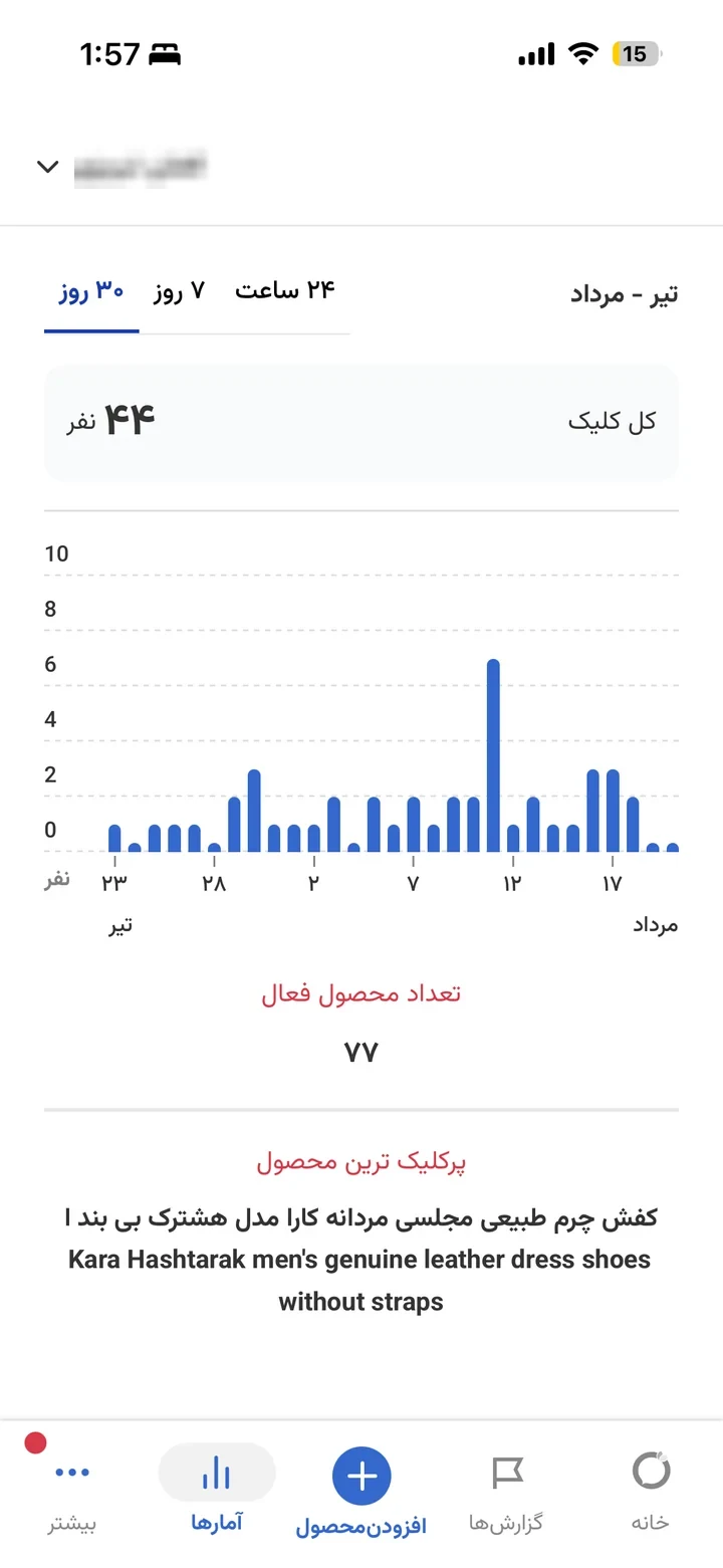
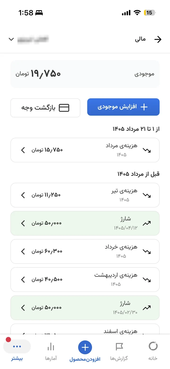
Registration is the beginning, not the point. The value of the panel is whether a seller returns to it to change a price, check what sold, or add stock.
The buyer side: Torob Nearby
The panel only matters if a buyer ever reaches the shop. I redesigned the discovery side later, in the consulting role, so the two halves of the same idea finally matched.
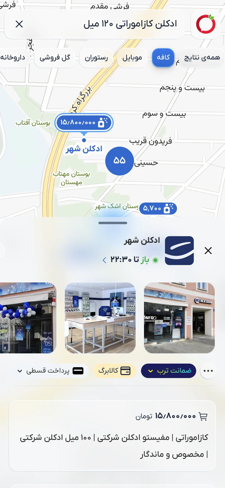
- Map and list stopped being two tools. They now stay in sync, so moving on one is reflected in the other instead of feeling like separate screens.
- Pin overcrowding solved with clustering, keeping the map readable at every zoom level rather than turning into visual noise.
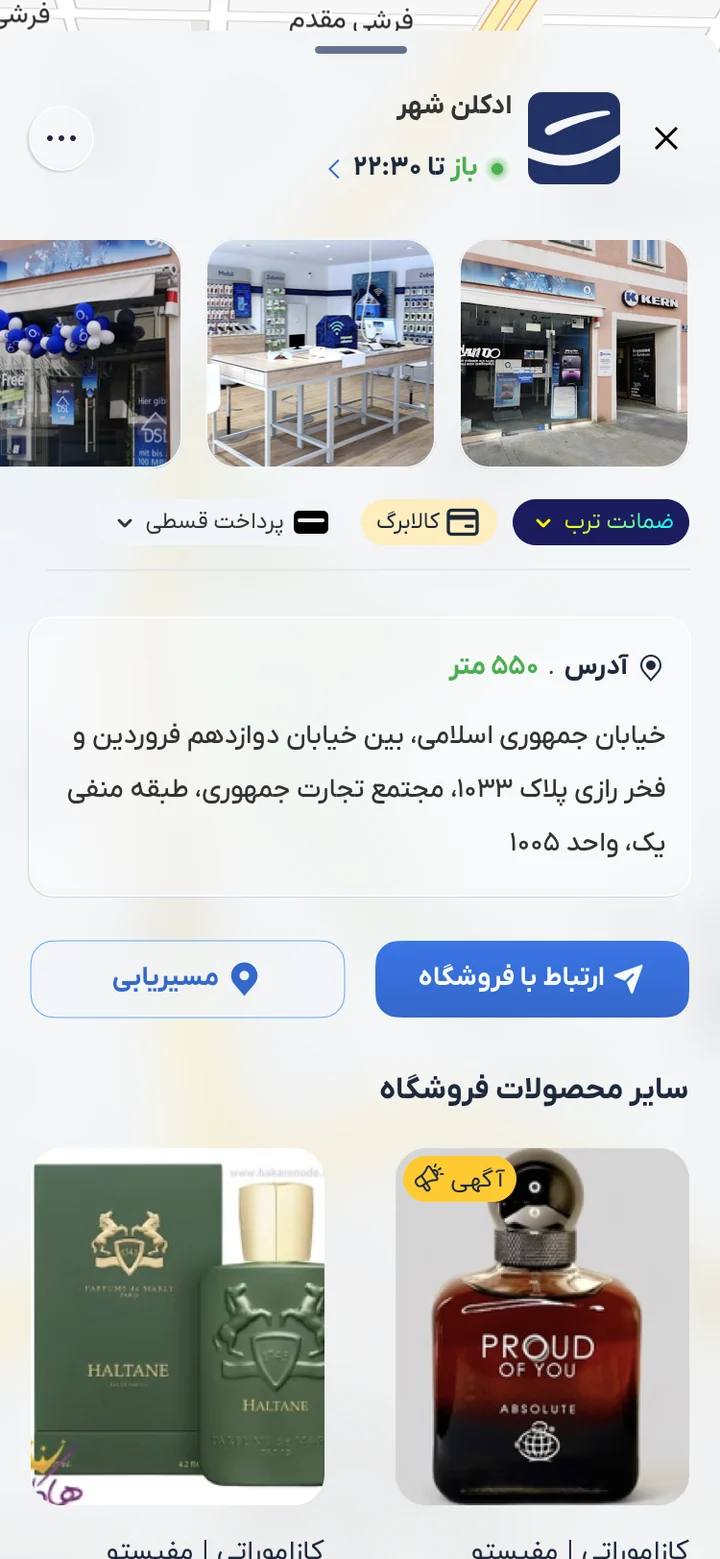
- The shop page carries the verification the panel collected: photos, address and the trust signals buyers said they used.


The support process behind it
Verification and a catalog still leave people stuck, and where they get stuck is the support queue. I owned the redesign of Torob's ticketing and chat support, rebuilt as a messenger-style conversation rather than a form, with AI-assisted assistants taking the requests that did not need a person.
- A conversation, not a ticket form. Sellers already knew how to use a messenger, so the support experience borrowed that model instead of teaching a new one.
- Assistants took the repeatable requests, which is where the recurring questions from the panel research ended up: the same issues, answered once, properly.
- Automated handling scaled around 50x in one growth period, resolving roughly 9 in 10 of what it took on, and chat support grew close to 15x in volume.
- Same instinct as the panel work: find where people get stuck, write it down, and fix the process rather than only the screen.


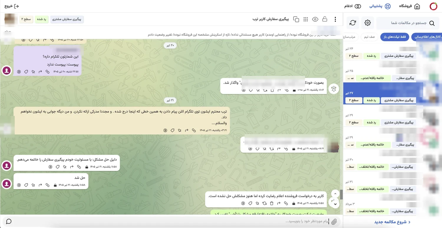
Those two multiples deserve a caveat I would rather give than have someone find. They come from an internal report written to show growth during a rapid assistant rollout, not from a support quality audit. They say the automation scaled and that it closed most of what it picked up. They do not say whether the people behind it were better served, and I do not have a number that does.
Results
Registration volume scaled with the product rather than plateauing: 2025 starts grew 36.5% over 2024, and by roughly seven months into 2026 the year had already reached 98.6% of the whole of 2025. The busiest single month in the data added 340,762 products across 23,262 shops.
Two of those figures are worth reading carefully rather than quickly. The 55.3% is measured against sellers who passed the eligibility gate, not against everyone who opened the flow, because the third who said they do not sell in person were filtered on purpose. And the 91% is the strongest evidence that decision 2 was the right call: connecting sellers to the existing catalog, not the manual form, is what actually built the inventory.