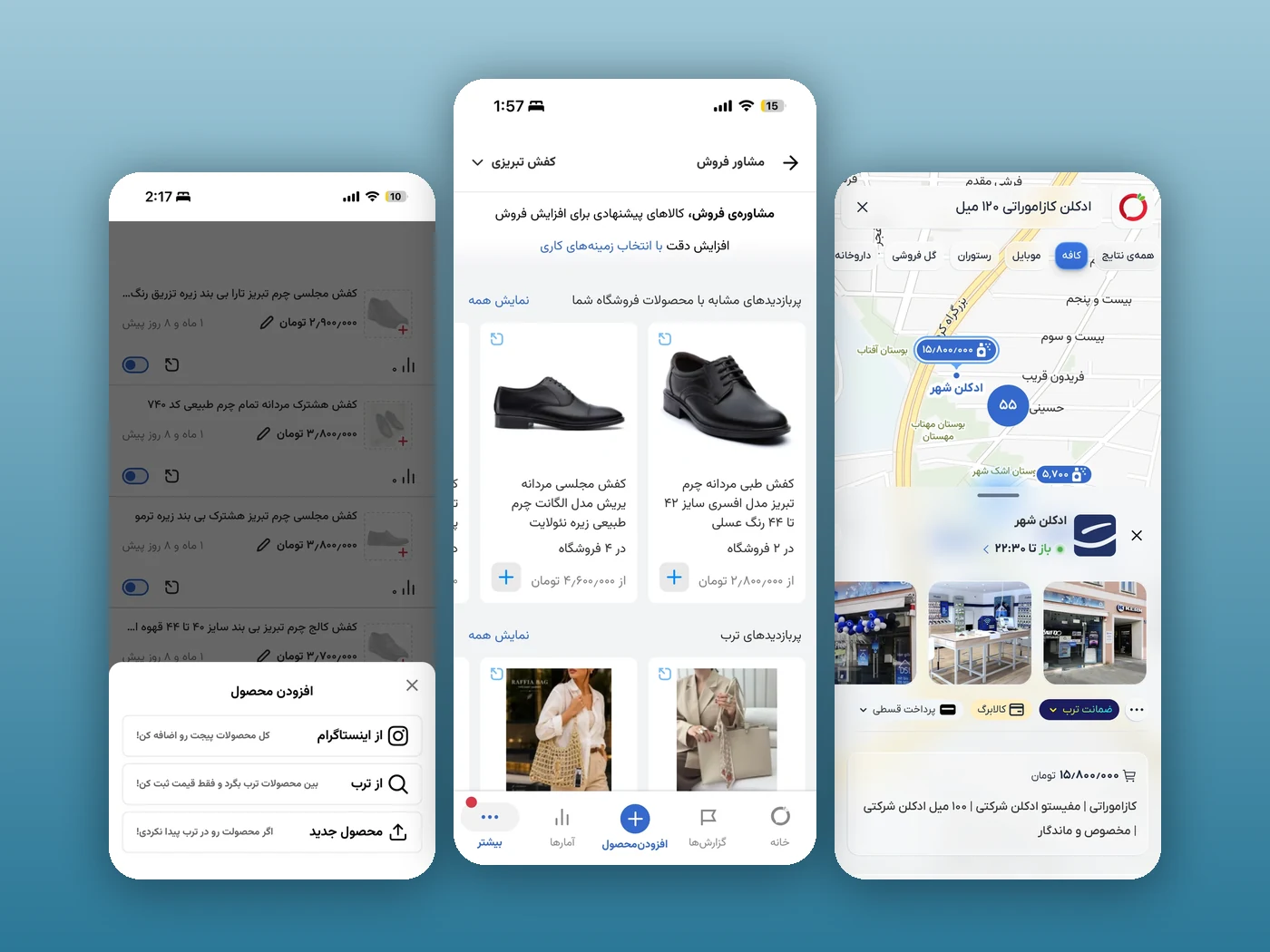
An AI-guided shopping flow designed for Torob to help users move from uncertainty to confident purchase decisions with less friction and clearer seller guidance.
Planned and ran review sessions each round, new sketch or prototype, feedback capture, and a clear next iteration.
User research
Led field research, interviews, surveys, and usability testing; in the first phase, another designer and the VP of Product joined me on interviews and research synthesis.
End-to-end design
Owned UI, micro-interactions, animations, user flows, and interaction design from concept through shipped MVP; final UI crafted in Sketch.
Data-informed iteration
Found user patterns from product data and improved flows, content, and CTA logic after the MVP release.
Cross-functional delivery
VP of ProductFront-end leadBack-end devData team
Partnered with engineering on feasible, cost-efficient solutions aligned with Torob’s design system.
AI & analytics tooling
SketchUX PilotFigmaMetabase
Final UI in Sketch; AI-assisted exploration with UX Pilot and Figma; Metabase data reviews with the Product Lead and Data team.
Production-ready motion
Delivered animations as production-ready code to front-end, not just static specs.
Problem and challenge
Users reached PDPs with high purchase intent, but hesitation blocked conversion. The most common blockers were product compatibility uncertainty, low trust in seller choices, and unclear stock and delivery details, along with delivery-cost confusion, post-purchase worries, and a recurring need for human reassurance before paying.
1User side: Shoppers needed reliable answers tailored to their specific situation, not generic FAQ text.2Business side: Torob needed clearer guidance that increases confident clicks to sellers without adding friction.3Design side: Introduce AI support in a trust-sensitive marketplace flow while keeping the interface simple.
Goals and success metrics
Primary product goalHelp users move from question to purchase decision in one guided flow.Success signalsHigher conversion to seller CTA, stronger answer satisfaction, and early retention growth.Quality criteriaFast entry, concise responses, transparent recommendation logic, and clear next action.ScopePDP-first rollout with paths that support both B2C shoppers and B2B consultant-seller scenarios.
Process
1. ResearchDefined stuck moments across the purchase journey.2. IdeationExplored conversational and contextual guidance models.3. ConceptingDesigned low-friction entry points on PDP.4. Prototype + collaborationIterated with front-end, back-end, and data partners.5. ValidationRan repeated design reviews and user checks.6. IterationAdjusted content, CTA logic, and interaction timing.
Iteration 1 · Early pilot to capture real questions
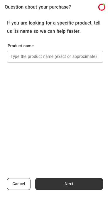
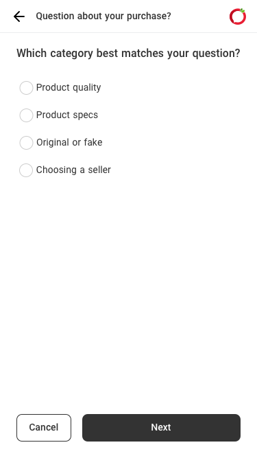
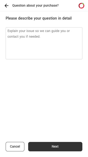
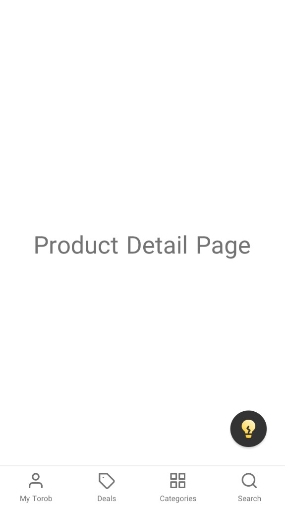
The first release was deliberately scrappy: a floating chat button, available on any page, led into a short survey and then a free-text question. The goal was not polish; it was to extract real user questions and understand intent patterns before committing to a direction.
What we learnedUsers rarely chose the FAQ options; they clicked through three fast steps just to reach the question box and ask in their own words.DecisionTreat the wizard as a research instrument: keep the always-available entry, drop the structured intake, and design around direct questions.
Entry point on any page
Step 1 · Name the product
Step 2 · Pick a category
Step 3 · Describe in detail
Iteration 2 · Content approach fails, the real need emerges
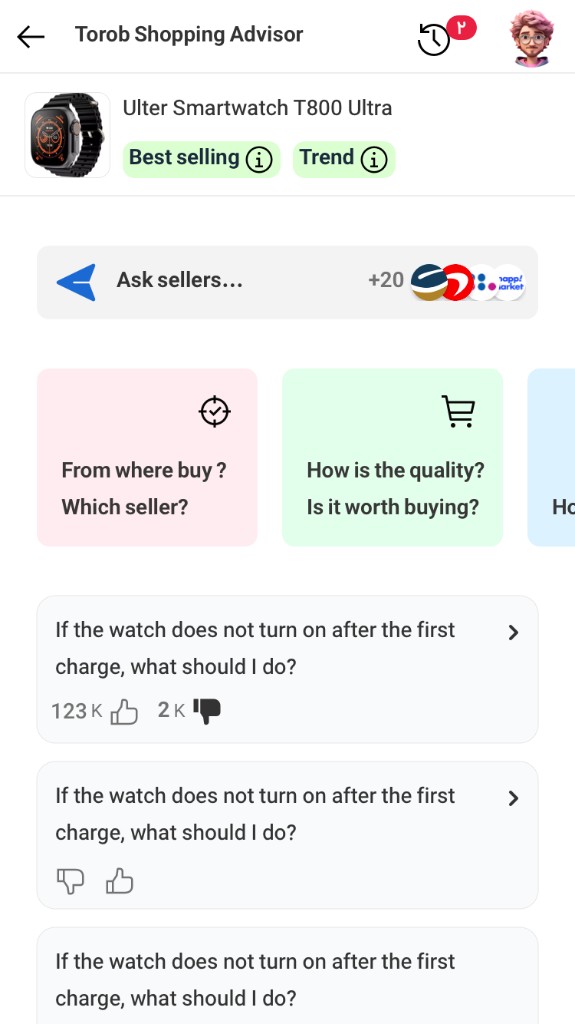
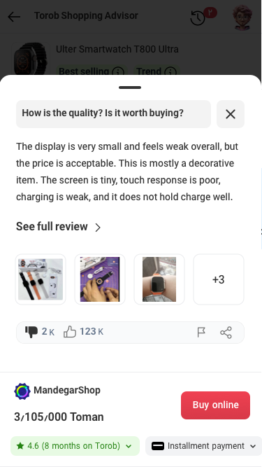
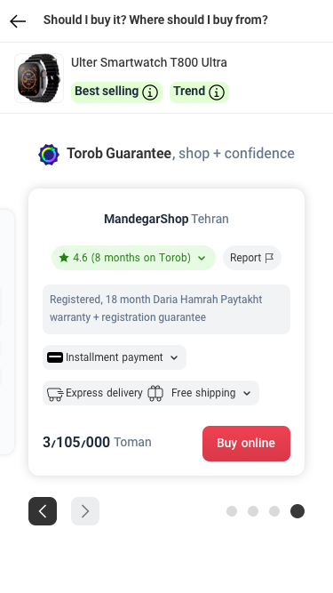
The second iteration bet on structured content: a guided advisor hub on the product page with suggested questions (“Where should I buy?”, “Is it worth buying?”), bottom-sheet answers, expandable full reviews, and a clear “where & who to buy from” recommendation. The research verdict was decisive: users do not read articles, most shops cannot produce them, and many products are non-standard. People wanted a specialist, not long content.
Users ask, they do not readSuggested questions and articles underperformed; users strongly preferred asking their own unique question.Content does not scaleMost shops, especially small and offline sellers, cannot produce articles and have little motivation to write.Experts over generic textNon-standard products (special parts, technical items) need a specialist’s confirmation, not generic answers.B2B: Consultant Seller modeQualified sellers opt in via the seller panel to be recommended as advisors, keeping visibility fair for every shop.
Advisor entry on the product page
Advisor hub with suggested questions
Concise answer in a bottom sheet
Expandable full review
Where & who to buy from
Iteration 3 · MVP: ask instantly on the PDP, the version that shipped
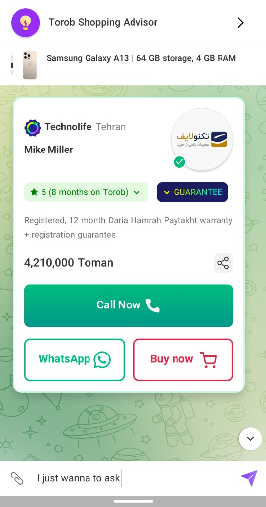
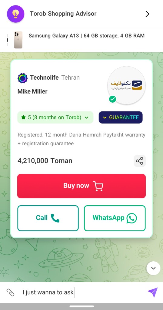
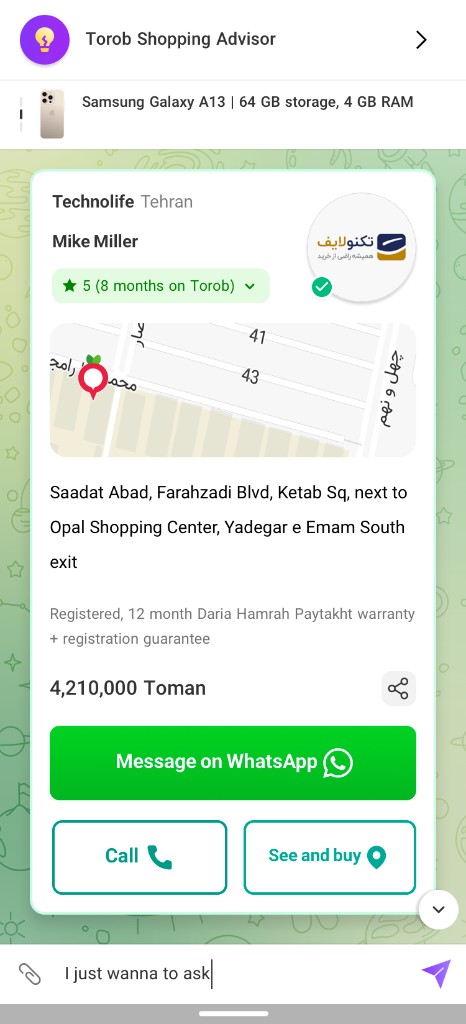
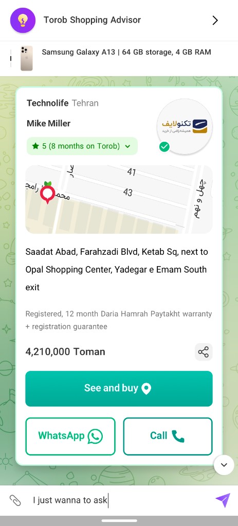
Grounded in 28 million daily product-page views, the MVP moved the question box directly into the PDP: no extra steps, ask instantly. After sending, users receive a short AI-generated expert answer, then the best-matched seller for consultation, and finally a direct purchase option for fast checkout. Once a seller is recommended, the action buttons reorder dynamically, Call, Buy, WhatsApp, or See & buy, so the most actionable option for that seller and moment leads.
Zero-friction entryThe ask box lives on the PDP itself, where 28M daily views already happen; users ask in their own words with no extra steps.Dynamic CTA prioritizationTime-based logic: Call leads in normal hours; Buy or WhatsApp lead on nights and holidays, by seller type.Post-launch optimizationAnimated FAB, button micro-interactions, and CTA timing lifted CTR by 5% and general conversion by 10%.
Inline “Ask Torob” on PDP
Ask in your own words
CTA order · Call first
CTA order · Buy first
CTA order · Chat first
CTA order · In-person first
Final solution architecture
Iteration 3 is the final solution. Nothing after it was a new direction: the animated FAB, the button micro-interactions and the CTA timing were refinements made on top of the shipped MVP, and they are what lifted CTR by 5% and conversion by 10%. The architecture below describes that shipped version.
Contextual entry pointAssistant appears where users naturally hesitate: product detail pages and seller decision moments.Intent-aware responseAnswers focus on fit, trust, and practical buying criteria rather than generic product description.Decision bridgeEach answer connects to a recommended next action, shortening the path to trusted sellers.Marketplace fairnessConsultant-seller mode broadens visibility for qualified sellers while preserving clarity for users.
Results
661,000Users in first 6 weeks32%Conversion rate10%Retention rate+5% CTR / +10% conversionFrom time-based CTA and interaction improvements
Reflections and next steps
Key takeawayIn high-intent shopping, short and contextual guidance beats long educational content.Design principleEvery answer should reduce risk perception and immediately suggest the clearest next move.Future evolutionExpand personalization depth and improve explainability around seller recommendation logic.