Case study summary

Curio

An AR museum-quest web app that replaces the lonely audio guide with a shared, gamified adventure. Built for the Prototyping for Design Leadership course at THI, and validated on site at Golestan Palace and the Deutsches Museum. I designed it end to end, then built the working web app myself using AI-assisted coding.

Web app, no install AR quests Designed and built M.Sc. THI

My role

DesignFront-endResearchAI-assisted build

I owned this end to end: the research, the product strategy, the interaction and visual design, the UI kit, and then the working web app itself.

The build was AI-assisted, using Claude Code and Cursor, which is what made an 18-screen working product feasible inside one course. The design decisions are mine; the AI accelerated the implementation, not the thinking.

Project snapshot

  • Course: Prototyping for Design Leadership, M.Sc. Design Leadership at THI, with Prof. Simon Mayer.
  • Surface: web app on iOS, Android and desktop. No install, no account.
  • Scope: 18 screens across five journeys.
  • Validated: on site at Golestan Palace, Tehran and the Deutsches Museum, Munich.
  • Markets: Europe and Iran, with a fully localised Farsi right-to-left interface.

The insight

Audio guides isolateGroups split up40-minute wall

A Saturday at the Deutsches Museum. Three friends walk in together and drift apart within minutes, each in a different hall, earbuds in, heads down. The audio guide isolates. The plaques are walls of text nobody finishes. After 40 minutes the energy drops.

One visitor said it at the exit, and it became the problem statement for the whole project: "We came together, and toured alone."

So: what if the museum stopped being a gallery to read and became a game board to play, together? Each exhibit becomes a clue. Each visitor takes a role. Each visit becomes a quest finished as a crew.

From SHAMS to Curio

Version 2Same lineage

Curio is the second major version of the AR Museum Tour app, my B.Sc. final project. That version did two things well: AR scanning to reveal an exhibit's hidden layer, and a visit planner that built a route around the time you actually had.

What it exposed was the gap. One narrow scenario, no way to go from a solo visitor to a shared visit, and no way for guides or museums to build their own quests.

Curio keeps the AR scan and the time-aware planner, and adds the social layer, the team-up flow, quest creation with AI, and a three-tier prize system. The SHAMS AR build was field-tested and recorded at Golestan Palace; that footage is on the AR Museum Tour page.

Who it is for

Three visitors with three distinct jobs to be done, plus the supply side that makes Curio a platform rather than a single-player app.

  • Lena, 26, digital-native explorer. "When I tour alone, make the visit visual and social, something I would share." The Explore feed curates quests by museum and category for exactly this person.
  • The Müllers, family with kids aged 8 and 12. "When the kids get restless, give us one game to play together." Every member has a real role in one shared quest, so nobody is behind their own screen.
  • Amir, 34, international tourist with accessibility needs. "When signs are not in my language, let me read, hear and see the story anyway." AR plaque translation, audio modes, and a fully localised Farsi RTL interface.
  • Quest creators and cultural institutions. Guides, community hosts and museums build quests with AI or templates, attach prizes, and bring their own audiences.

How I validated it

Contextual inquiryIntercept interviewsModerated testingCompetitor teardown

Four methods, all run with real visitors in real museums before any significant code was committed.

  • Contextual inquiry. Shadowed visitors at Golestan Palace and the Deutsches Museum, watching phone use, audio-guide drop-off, and where groups split apart.
  • Intercept interviews. Asked at the exit: what was most confusing today, and would you have wanted to do this with someone?
  • Moderated usability testing. First-time visitors used the web app on site at Golestan Palace. I watched every tap and every point of friction without intervening.
  • Competitor teardown. Used Smartify, Google Arts and Culture and the Rijksmuseum app inside a real museum. None support teaming up or sponsored prizes. That is the gap.

Testing in a real palace with real crowds surfaced problems no desk review would have caught: people freezing at the AR viewfinder with no guidance, force-closing the app when trapped in the camera view, and never finding the scan action because it was buried in the Create tab.

The three flows that matter

Every screen in the app serves one of three flows.
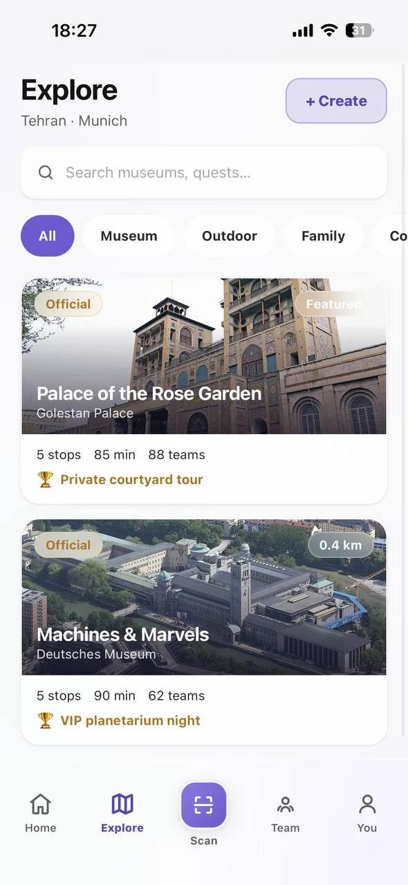
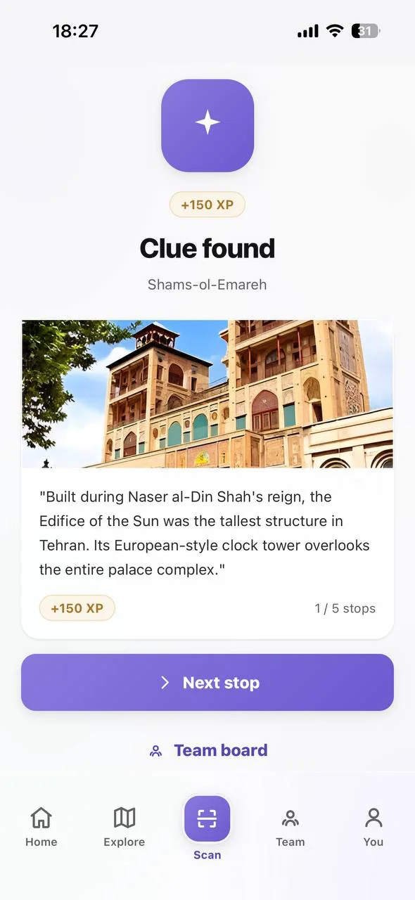
  • Core quest. Browse the Explore feed, pick a quest solo or as a crew, start from the planner, hunt stops with AR, unlock each exhibit's story for 150 XP, finish with a badge and a recap.
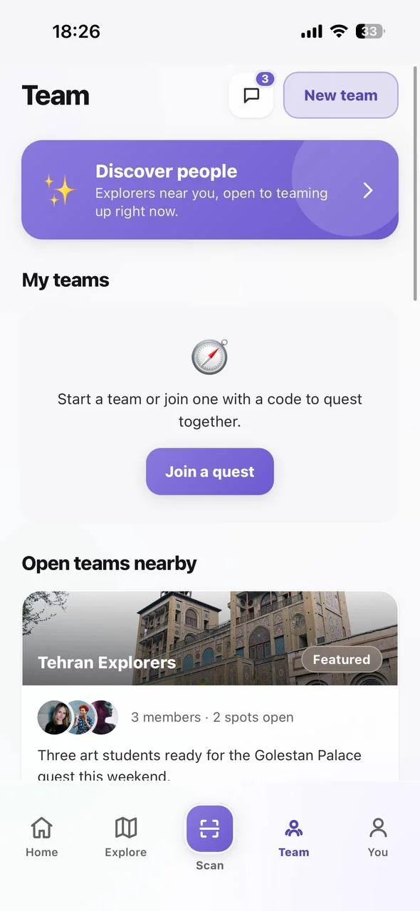
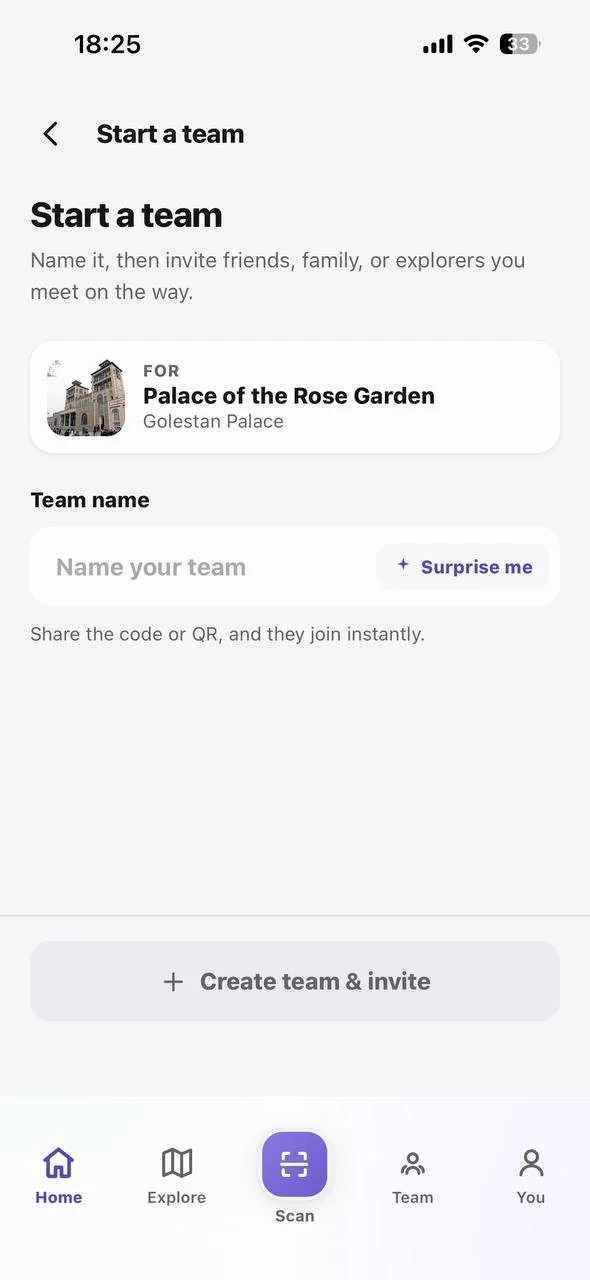
  • Play as a crew. Start a team, name it, share a code or QR, and teammates join instantly. A live crew board shows everyone's progress and chat keeps the energy up between stops.
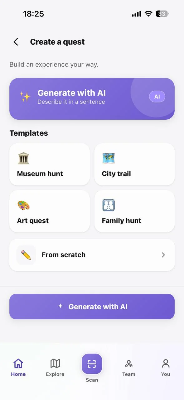
  • Create a quest. Four templates, a from-scratch builder, or AI generation from a single sentence. Template creation takes under five minutes for a first-time organiser.
Explore feed: quests by museum and category across Tehran and Munich
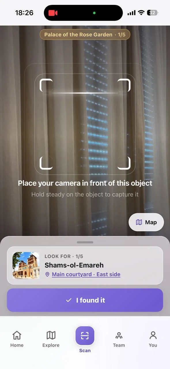
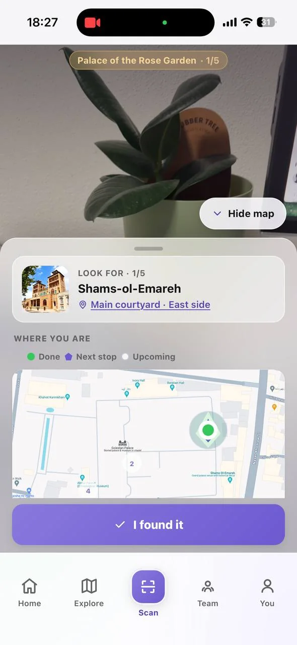
AR viewfinder with the bracket guide and the map toggle
Clue found: the exhibit story unlocks and awards 150 XP
Team tab: open teams nearby, with spots left and the quest they are running
Create a quest: AI generation, four templates, or from scratch

Six findings, six fixes

All six came from the on-site sessions at Golestan Palace and intercept interviews at the Deutsches Museum. Every one of them changed what shipped.

  1. Scan was buried in the Create tab. The core AR action took three taps and visitors could not find it on a real walk-through. It moved to its own primary tab in the centre of the nav bar, one thumb-reach from anywhere.
  2. Generic dark theme and a fictional location. The first build used a placeholder dark identity and a made-up city gate, and nobody felt grounded. Rebuilt around real Golestan Palace photography and a clean light palette.
  3. Static AR viewfinder with no guidance. Visitors froze at the scan screen asking what they were pointing at. Added a corner-bracket viewfinder, a "place your camera in front of this object" prompt, and a map toggle that keeps context visible.
  4. Sign-up wall before any experience. Asking for an account before the first AR moment killed first-session momentum. Profile setup is now the first screen, name and photo only, and the first quest starts straight after.
  5. Icon-only tabs with no accessible labels. Screen readers could not navigate the app. Every tab is now labelled, with ARIA roles and 44px minimum tap targets throughout.
  6. Trapped in the AR camera view. Once in the scan view testers had no way back and several force-closed the app. Added a map toggle and a persistent back action on every AR screen.

Before: the dark iteration that on-site testing replaced

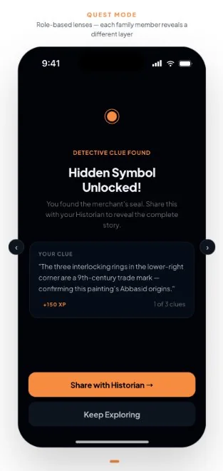
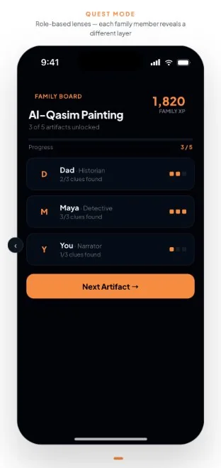
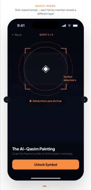
These four screens are from the build used in the first on-site session. The role system and the family board worked, but on a placeholder dark identity with a fictional exhibit. Findings 1, 2 and 3 all pointed here.
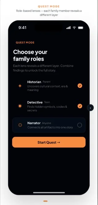
Before: role selection in the dark iteration
Before: the static AR viewfinder that gave no guidance
Before: clue unlock in the dark iteration
Before: the family board in the dark iteration

UI kit foundations

The UI kit that came out of the post-test rebuild, applied consistently across every screen.
  • Colour. Brand gradient #8979DD to #6D5AD0, ink #5746B3, reward gold #E7B45F, success #18A957, surface #F7F6FB, plus four swappable accent themes.
  • Type. Wordmark in Oregano. Plus Jakarta Sans for the interface: display at 800 weight, body at 400 and 500, labels uppercase at 700.
  • Spacing. A 4-point base grid with consistent 8-point gutters.
  • Radius. 14 for cards, 20 for panels, 100 for pill buttons.
  • Accessibility. 44px minimum touch targets, ARIA roles and visible focus states on every interactive element.
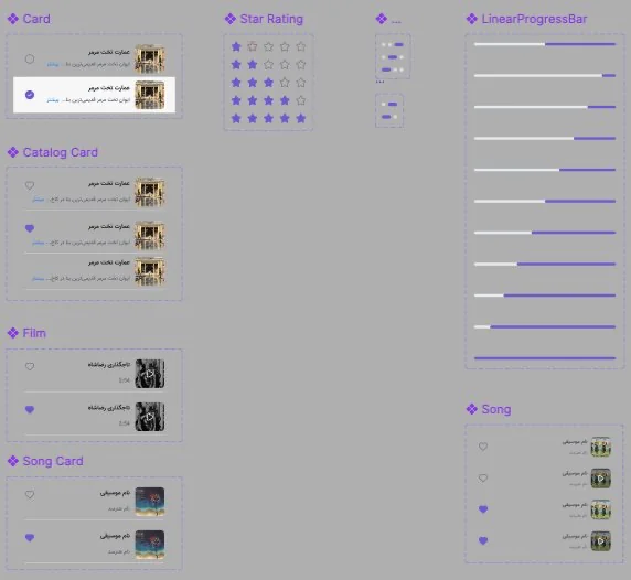
  • Farsi RTL. A native right-to-left variant of the kit for the Iran market. Buttons, icons, navigation and cards are structurally mirrored, not a translated skin. The same layout work powers the in-app plaque translation.
Farsi component library: cards, star ratings, progress bars and catalog tiles, mirrored right to left
The Farsi component library, structurally mirrored rather than translated

Business model

Three payers, one platform, no single dependency. Each stream has a launch phase, so the business case reads as a sequence rather than a wish list.

  • Consumers. Quest Pass for unlimited creation and AI credits, a Family Pass for the whole crew, and in-app purchases for AR lens packs and badge bundles.
  • Creators. A creator tier giving guides and educators more quest slots, branded pages and per-stop analytics, plus AI credits beyond the free monthly allowance.
  • Institutions. Annual partnerships for featured placement and visitor analytics, and per-campaign sponsored challenges with a prize for the leaderboard.

The web app

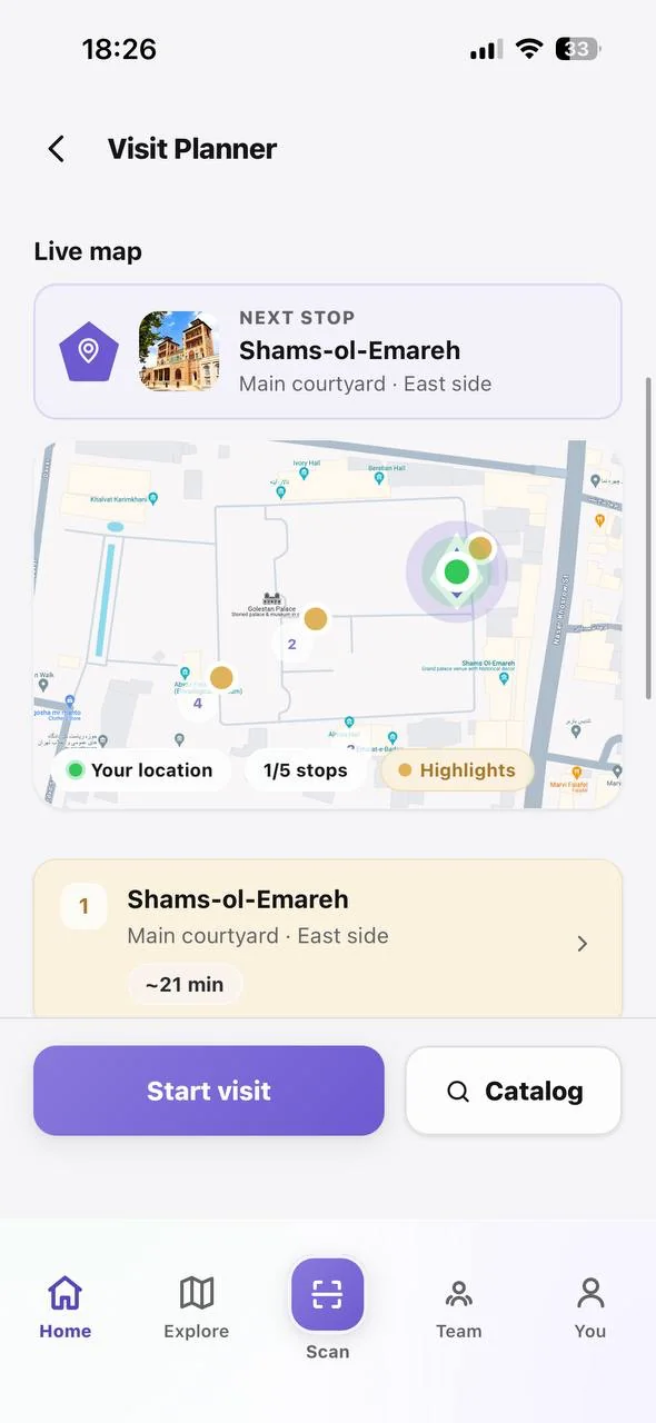
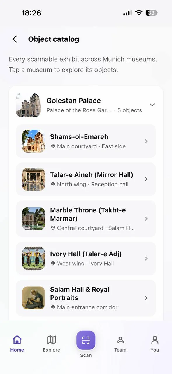
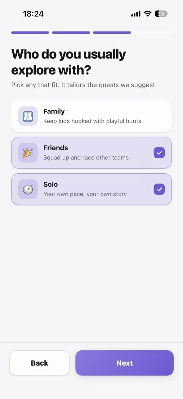
Every screen below is captured from the live web app. Onboarding takes under 60 seconds with no email and no password, and the visit planner is inherited directly from the SHAMS version.
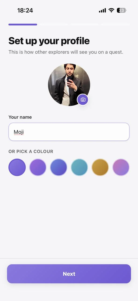
Onboarding: set up your profile with a name, photo or avatar colour
Onboarding: who do you usually explore with
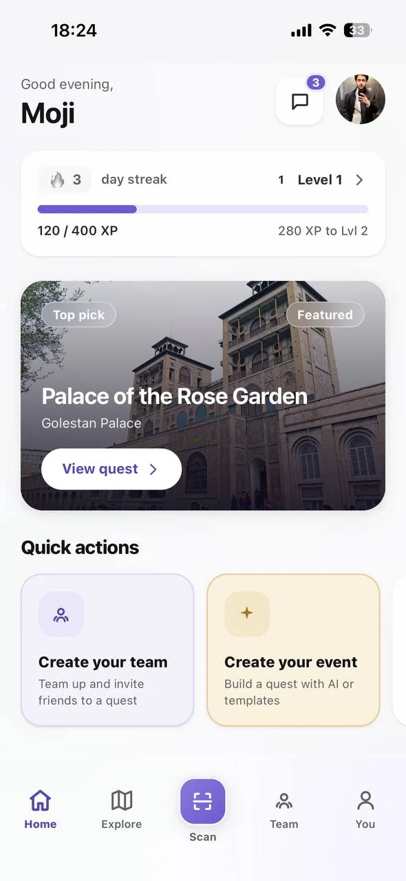
Home dashboard with streak, XP progress and a featured quest
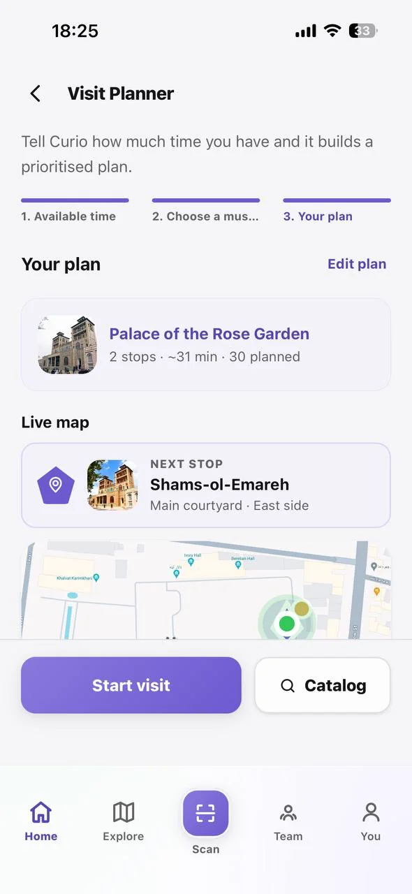
Visit planner: a prioritised route built around the time available
Visit planner with the live map and the next stop
Object catalog: five scannable exhibits at Golestan Palace
AR view with the map revealed
Start a team and share a code or QR
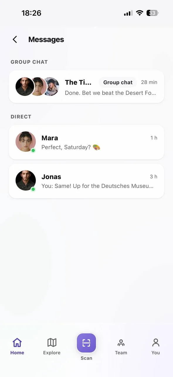
Messages: group chat and direct conversations between explorers
Profile: level, XP and rank among 3,800 explorers
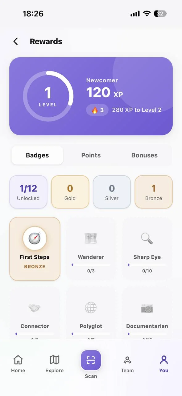
Rewards: badges across gold, silver and bronze tiers

Learnings

On-site testingDesign plus build

On-site testing is not optional for a spatial product. Six findings changed what shipped, and not one of them would have surfaced in a desk review. People freeze at a camera viewfinder in a way they never do in a click-through prototype.

Designing and building the same product changes the design. Because I implemented it myself with AI assistance, the loop from a testing finding to a shipped fix was hours rather than a sprint. That speed is why all six findings made it into the final build.

A second version earns its scope from the first. SHAMS proved the AR moment worked and exposed exactly what was missing. Curio did not start from a blank page; it started from evidence.

Continue exploring